
In any bit of publicity, imagery is hugely important. What should you choose to illustrate your story?
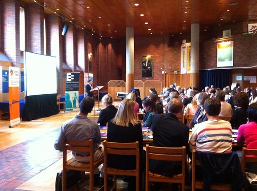
What does a typical audience look like?
As a microscopist, I know all about the challenges of finding a ‘typical image’. If you are trying to demonstrate some interesting structure or correlate some feature which you’ve imaged in different modes, then making sure you find an image that makes your point clearly is obviously going to be crucial. However, then you are faced with the challenge of deciding whether what you are getting so excited about is actually an artefact and you should be moving swiftly on. How many times do microscopists chase the ephemeral not-really-there feature that is simply due to poor sample preparation, contamination or (speaking as an electron microscopist) resulting from that pernicious danger of electron beam damage which changes the image literally as one watches, often before the focus is ever got right?
As an illustration of the challenges in electron microscopy, when I was a young research fellow I was studying a now (largely obsolete) class of polymers known as thermotropic liquid crystalline polymers. Optically, when the molten samples were smeared out to produce a thin film, a characteristic structure was seen – almost independent of the polymer’s chemical details – which we termed the banded structure. Trying to get more sense out of what the underlying molecular packing was I turned to transmission electron microscopy. The trouble was the structure could only be seen using so-called dark field techniques, which require quite a lot of setting-up to achieve as the image is formed from only a small part of the diffraction pattern, which anyhow does not consist of sharp spots since this isn’t a crystalline material.
I used to go into the department at weekends, when no one else was around (safety issues were less considered back then), so I could get uninterrupted access to one of the older microscopes, and shoot a hundred or more images. I wanted to get pairs of images taken using different parts of the diffraction pattern along with the standard ‘bright field’ image. And I had to work incredibly fast because the polymer degraded under the electron beam and any sort of orientation in the diffraction pattern vanished rapidly. Out of 100 images only a handful would be usable, either because of damage before I’d manage to capture all the images, or because of the difficulty of acquiring good matching sets of three images with the right exposure on each of the photographic films (no digital recording back then, and getting the exposure right was an inexact science). So, what was the ‘typical’ image, since so many of them were failures? Publishing artefacts is unwise, so I needed to be absolutely sure I’d nailed this before writing a manuscript.
This week I was amused to see some other ‘typical’ images. Not so long ago, when A Level results came out, the various media outlets always managed to publish pictures of ecstatic blond girls jumping in the air while clutching bits of paper which were allegedly their exam results. This means of illustrating the A Level story has fallen from favour, I’m glad to say. People now recognize that many of the students who do well are neither female nor blond. But what struck me this year, looking at the images accompanying the various write-ups, was how, not only were there no blond girls on show, there were practically no white students of either gender visible. This year (and maybe in previous years too), the images seemed to be dominated by BMEs of various kinds.
Diversity if of course excellent and I’m delighted to see BME students thriving. However, how typical are they of the A Level cohort? The statistics will be out there telling us what proportion of students taking A levels are of which ethnicity and I am pretty sure the images were over-compensating for the years of blond girls. So what is typical and what should be published by way of illustration?
Of course as regards this story it doesn’t matter at all if the images are non-representative. It is good to remind the reader that not everyone in this country is white. But in other situations the message given by publicity material, for instance, does matter in conveying an accurate message. About 15 years ago my department – note, this is a Department of Physics, so you can work out roughly what proportion of students and staff are women – produced a draft document which I was sent to comment on. I think the head of department was slightly startled when I objected to the imagery. Looking at the photographs on page after page – of seminars, lectures and laboratory classes – you might have been forgiven for thinking that men really don’t like Physics. It was absurdly out of kilter with the reality on the ground. Indeed, they must have tried quite hard in the lecture theatres to find some angle in which so few male students were visible – or else had stage-managed the whole thing. I felt this was deeply misleading and totally unconvincing, but it certainly had not occurred to those who had put this draft document together that it would be unwise to fake things this badly. (They did, I’m pleased to say, amend the document before publication.)
So, when producing publicity for a department like physics, where women are in the minority, or for a Cambridge college (such as my own) where there are BME students but they are not as thick on the ground as at, say, QMUL, Leicester or Brunel, what should we be producing? In this case we are not trying to produce ‘evidence’, as in a scientific paper, but to demonstrate the possibility of all genders and races being welcome. Diversity is so many-facetted that in a single document of only a few pages it is unlikely to be possible to be statistically (or slightly optimistically) representative, but one has to try.
The ‘typical image’ is as misleading a concept in publicity material as it is in a scholarly paper populated with micrographs. In both cases one is trying to make the best job one can out of imperfect information and statistical limits. It is an effort that is constantly worth making.
Some PoC I know have expressed cynicism at the “one of each” marketing images that most corporations tend to produce these days. It’s a difficult balance!