I looked at one of my progress tracking graphs for one of my projects right after telling my colleague that Mr E Man had worked on the new Godzilla movie, and what I saw can not be unseen.
Eep.
About Cath@VWXYNot?
"one of the sillier science bloggers [...] I thought I should give a warning to the more staid members of the community." - Bob O'Hara, December 2010
(having said that, can you believe it’s been 16 years since the Matthew Broderick version came out?! I couldn’t)
Mr E Man worked on it for several months last year, and we saw the first preview when we went to see The Hobbit on New Year’s Day. I do like a good creature feature, so I’m definitely going to see it!
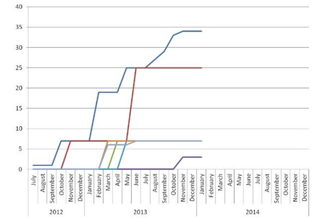
I have a whole bunch of summary spreadsheets and charts for my projects. I like this one because it really lets you see the bottlenecks in the process. For instance, we batch-process samples to save money – especially the process represented by the red line. We can’t start the rest of the processes until this step is finished, and then it takes a while to complete the next analyses after that (this graph shows when something is finished, not started, so there’s been tons of activity going on since the last red batch finished in June, but it’s not showing up on the graph yet. All the other lines are going to shoot up to the current red level within the next couple of months, and then there’ll be another long plateau). We knew this was an issue, but this graph has demonstrated how important the red step really is. So we’re talking to other projects to try and find someone else who also submits batches of samples for the red process, to see if we can combine our submissions. That would allow us to get to a sample number that brings the price down to a more reasonable level more often.
it was. I’ve been looking at different ways to graphically show progress/projects. And then of course not using MS Projects all the time (not everyone has it so it’s harder to work on a group basis with it, but I like it for tracking/planning purposes. This type of graph though, with the months and completed makes it very clear. As you said, it does make it obvious where the projects have “stalled” or “waiting for someone (Godot?)” 😉


It happens.
I didn’t know a new Godzilla movie was coming out! Seems to have taken over both your lives. . .
There’s always a new Godzilla movie coming out.
(having said that, can you believe it’s been 16 years since the Matthew Broderick version came out?! I couldn’t)
Mr E Man worked on it for several months last year, and we saw the first preview when we went to see The Hobbit on New Year’s Day. I do like a good creature feature, so I’m definitely going to see it!
I did not know there was a Matthew Broderick version. The idea of it is just making my head spin =)
what
huh, marking your projects like that…. that might be something I should start with too. THanks for the suggestion/tip!
Was this post actually… useful?! I’m astonished 😀
I have a whole bunch of summary spreadsheets and charts for my projects. I like this one because it really lets you see the bottlenecks in the process. For instance, we batch-process samples to save money – especially the process represented by the red line. We can’t start the rest of the processes until this step is finished, and then it takes a while to complete the next analyses after that (this graph shows when something is finished, not started, so there’s been tons of activity going on since the last red batch finished in June, but it’s not showing up on the graph yet. All the other lines are going to shoot up to the current red level within the next couple of months, and then there’ll be another long plateau). We knew this was an issue, but this graph has demonstrated how important the red step really is. So we’re talking to other projects to try and find someone else who also submits batches of samples for the red process, to see if we can combine our submissions. That would allow us to get to a sample number that brings the price down to a more reasonable level more often.
it was. I’ve been looking at different ways to graphically show progress/projects. And then of course not using MS Projects all the time (not everyone has it so it’s harder to work on a group basis with it, but I like it for tracking/planning purposes. This type of graph though, with the months and completed makes it very clear. As you said, it does make it obvious where the projects have “stalled” or “waiting for someone (Godot?)” 😉