
As I’ve mentioned in a few recent posts, the interconnectedness of the (small and young but growing nicely) Vancouver science sector continues to amaze me. At most large work-related meetings and at every sciency social event I attend, I run into a few former colleagues and a much larger number of second- and third-degree contacts – at Science Online Vancouver last month, for example, I talked to a couple of dozen strangers, and discovered a mutual friend or acquaintance with all but two or three of them.
As in any network there are some especially connected people who form major “hubs”, as I mentioned on Facebook when I got home from SOVan:
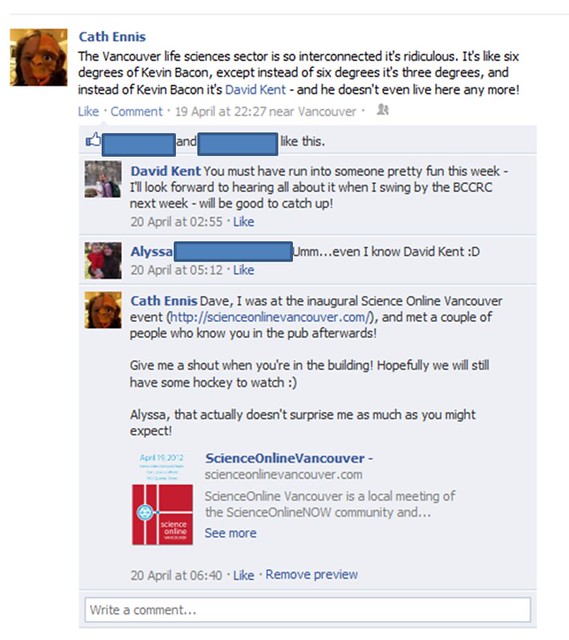
seriously – I only know Alyssa (who lives thousands of miles away) through her blog, and even she knows Dave Kent! Also, I suspect it’s actually only two degrees.
but anyone who’s been here for more than a year or two forms their own hub to some degree. Being about to start my fourth Vancouver job in ten years here, I’m probably approaching Very Important Hub status myself. So, when Beth Snow (who I met through – you guessed it – Dave Kent*) blogged about how you can map your LinkedIn network, I obviously had to follow suit.
Only a fraction of the people I know use LinkedIn, and I tend to only add people I’ve met more than once or twice, but enough of them have at least a basic profile that you can see some interesting features in my network:

Dave Kent is represented by the large pink circle above the “eri” of my name; Beth’s is the grey circle linked to Dave’s, to the right and slightly upwards. The burgundy circle on the edge of the big dark blue cluster represents a regular commenter who I worked with in my industry job, work with on some projects in my current job, and will work with full-time again as of June 1st. The burgundy-orange connections that run through the pale blue dots are also due to a regular commenter, but not a Vancouver-based one. Let’s see if they want to identify themselves in the comments!
The first thing I noticed is that private sector people seem to use LinkedIn much more than academics (look at all that dark blue!), which makes sense. Interestingly, one of the orange circles represents a friend I know from my PhD lab in Scotland who now works in the same US city as our industry collaborators. I stayed with her on one of my recent trips down there and she said she didn’t know anyone at our collaborators’ company, which makes me wonder how that city’s overall connectedness compares to Vancouver’s – she obviously does know at least one person who works (or used to work) there, even if she doesn’t realise it!
The second thing I noticed is that people I know from my current job are represented by two different colours, presumably reflecting differences in their own contact lists. Upon closer inspection the green circles mostly represent people in my current department, whereas most of the burgundy circles represent people I know from elsewhere in the organisation. According to this scheme, a few greens should really have been either burgundy or pink (postdoc department, which is in the same organisation) and vice versa.
And, of course, there are lots of links between the groups of people I know from all three of my Vancouver jobs to date! This supports my paranoia hypothesis that you just can’t ever afford to burn any bridges here – you never know how conflict with a current colleague or collaborator might come back to haunt you a few years or even decades down the line. It’s a good thing I’m so lovely and hard working and nice to work with and modest.
You should run the map app on your own contacts list – hours of geeky fun! I’d be interested to see how maps look in other sectors, fields, and in other cities – and I’m especially interested in seeing Dave Kent’s map 🙂
UPDATE: Dave has sent me his LinkedIn map, and says I can post it here. Thanks Dave!

The difference to my network is striking – more contacts, looser clusters, and more connections between clusters.
I bet Kevin Bacon’s looks pretty similar.
~~~~~~~~~~~~~
*I know him from my postdoctoral department, where he did his PhD; Beth knows him through the UBC branch of the Let’s Talk Science outreach programme, in which I participated as a postdoc. I think I even briefly met Beth at one of their pub nights in, ooh, 2003 or 2004, years before I met her properly. This is probably also how Alyssa knows Dave…?
Yup! Dave and I were both coordinators of LTS programs (him at UBC, me at Manitoba then UWO). And if you were at the pub in 2003 or 2004 for the regional conference, we might have met!
The Linkedin mapping thing is VERY cool – I’ll have to try it out!
First of all – I *love* that I get to be in the title of a category! Hooray for “Beth and other randoms!”
Second – was that the pub night where I was “retiring” from being the Coordinator of UBC LTS and Dave called me a “dinosaur”?
Oh, this is too funny! I was just talking with friends this week about how interconnected the Canadian science community is. The discussion stemmed from how many friends/lab alumni/collaborators we ran into at a conference last week. And one of those collaborators I unexpectedly ran into? You guessed it- the infamous David Kent.
Who’s David Kent?
I had no idea LinkedIn did maps. And I have no idea if I’m connected to you on it, or not. Must go check.
Alyssa, it wasn’t a regional conference – just a UBC event. And I don’t remember Beth being called a dinosaur, which isn’t to say that it didn’t happen – I arrived quite late, as I remember, and they’d almost run out of food
Liz, that is most excellent!
Richard, yes, you’re on the map – in the dark orange cluster, but linked to a couple of the burgundy people.
Hey Cath – you crack me up, and while flattering re: networks, the comparison to Kevin Bacon did really make me shudder…
I suspect that David Ng is the most connected Vancouver scientist online (or perhaps Rosie Redfield)… but importantly, the Vancouver science outreach and social media community is small enough that people CAN know each other. Being in England for the last three years has been a little challenging for keeping up those ties, but I think it gave extra motivation to get the Black Hole blog moving, so that was good.
Great seeing you in April briefly, I’ll look forward to when I can actually call Vancouver home again…(fingers crossed)
Hm… I tried this out for myself but it was really messy. The clusters included people not really related to each other. Most puzzling.
Thanks Dave – and thanks for the permission to post your map! (see updated post body).
I agree that Rosie Redfield is one of the most well-known local scientists online – but I’m not sure that automatically means she’s one of the most “connected” in the sense of actually knowing people well in multiple different organisations and being a mutual friend / close acquaintance for huge numbers of people. But then I don’t know her – I’ve seen her give talks a couple of times, and she recognised my postdoc supervisor’s name on the one occasion I actually talked to her – so I may be completely wrong!
Hope to see you back here permanently soon!
Richard, were there lots of connections between those clusters? I suspect that “too many” interconnections might mess things up.